How can I create an election map?
This article will cover how to create live data maps for users who subscribed to the Reuters U.S. election data feed powered by Edison Research and the National Election Pool (NEP), as well as how to create maps with a spreadsheet import.
The next quadrennial presidential election in the USA is scheduled for November 5, 2024. Are you going to watch closely what’s happening in the United States of America? For any report you are responsible for, you’d like to make sure you’re presenting the most up to date election status. We’ll help you with that.
We are partnering with Reuters to provide you with a U.S. election live data feed. You’ll be able to deliver a real-time vote count to your audience – for the presidential race, powered by Edison Research and the NEP data feed. This feed updates your customized interactive online map automatically.
Once the source gets updated, your online map will be updated too. Each county and state will be coloured indicating the current standings. Your audience will also be able to click, hover and touch over each area to obtain more information about the exact votes. If you prefer to show static maps on TV or download vector files for print, you simply need to download a map with the latest data. For any customization on the looks of the style, kindly get in touch with the Support team prior to the Election Day.
Let’s have a look at how you can create an election map.
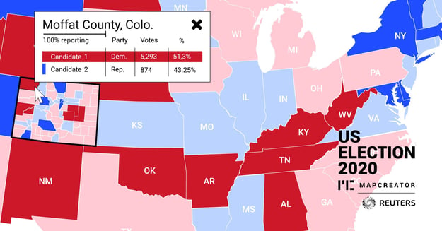
What Is An Election Map?
An election map is a type of map that shows the results of an election. It can be used to show the results of a presidential, congressional, or local election.
Election maps can be created using data from exit polls, vote counting machines, or precinct results. But with Mapcreator, data is exported directly from Edison Research and The National Election Pool. This means anyone can create their election map in Mapcreator with a quick data import from trustworthy news organizations.
Other than you can bring your own data to your Mapcreator election map. Collect your data in spreadsheets and import it to display on the election map.
How can you use election maps?
Election maps can be used for several purposes.
- Show and analyze the results of an election
- Compare the results of different elections
- Visualize data from exit polls, vote counting machines, or precinct results
Election maps might be helpful for organizations in journalism, politics, or any other companies responsible for presenting election reports. If you are into it and used to collecting and presenting all the data manually, we have good news for you. With Mapcreator, you can quickly turn your manual work into an automated process and save time.
The Live Data Feed Map
The first requirement is for you to be a Reuters News Agency customers as well as of Mapcreator. Contact us now if we can support you getting in touch with the responsible team.
Once you log in to the Mapcreator tool, go to the Mapstyle Settings to change your map style to for example the U.S. Election 2020 map style. The content of the popups as well as the colours and overall style are already predefined, which means you can go straight ahead and download your ‘WEB’ map as an iframe or URL. If you publish your map online, it’ll automatically update its colours and popup content – so your work here is done!
Here find some more details on how you can customize your interactive maps:
The map loads with the following settings:
- The reset button
- The headline with time update indication
- The legend
- The fixed popup
If you click on any of these map extras, the styling menu of each opens. These are the changes you can apply:
- the reset button: position and icon
- the headline with time update indication: change the headline or delete it and position
- the legend: text, how many entries and position
- the fixed popup: position
If you’d like to remove one of these extras entirely, you can click on them and press the delete key, or go to the submenu ‘Adornments’ and change the toggle there. We also recommend using any of the map’s corners for the positioning of the extras, instead of the ‘move freely’ option.
How can you customize the rest of the map?
The Mapcreator Support team will work with you prior to the Election Day on this project. We’re able to change the parties’ colors or which kind of font and font styles you’d like to use.
Please let us know in time – we want to make sure that you’ll be satisfied with the styling result.
What can you expect from the interactive output?
On Election Day & Night, this is what you and your audience can expect:
- Regular updates: the newest voting data comes in every 30 seconds –
the states’/counties’ colors update as well as the votes and percentage in the popups - State info: who won this state in 2016, votes, percentage and E.V.*
- County info: who won this county in 2016, votes, percentage
- % reporting: percentage of total expected vote**
* On Election Night, no Electoral Votes are awarded before a state has officially been called. However, certain states will be called despite 0 votes being counted. Race calls are an editorial decision made by Edison Research and the NEP, for the states. Clients may call a state themselves, mentioning that this does not reflect the opinion of Edison. Edison Research chooses to call some races early based on exit polling and the known historical voting patterns of a state.
** The percentage is the number of cast votes divided by how many voters are in a state and in a county. Total expected vote is the best estimate made by the NEP based upon all information that is available at the time. At the beginning of Election Day the total expected vote estimates are based upon the trends in mail and early voting reported by the states. Additionally, overall turnout trends are anticipated based upon pre-election telephone surveys measuring voters’ expectation for participating in the election. The NEP also uses information about the growth in voting eligible population and voter registration in each state and expectations from state and local election officials.
Next to that, you can offer your map in different languages. If you set your output languages to any of English, French, Spanish, Italian, Dutch, German or Danish, the text in the interactive map will also be translated.
Besides, you don’t have to show the whole U.S.; you can also focus on a particular state and download your interactive map showing its counties. Your audience will be able to pan and zoom to other parts of the country.
Hint: The reset button will allow your viewers to reset to the map view as you’ve defined it.
Pro tip: Why don’t you offer a general election map, and additionally create separate articles and maps focussing on the swing states?
The interactive results graphics will continue to be updated until a winner is projected for the presidential race by the NEP/Edison (this may be days or even weeks). The update interval might change from 30 seconds to a larger interval later.
Some counties do have other candidates than the two major ones. They will be displayed if more than 1% of the votes are allocated to them. Write-ins are candidates that have been appointed by eligible voters even though they were not listed as official candidates previously. We will group Write-ins together and report them as such.
The Manual File Import
Let’s go through the steps together, so you can create an election map with a file import.
For this article, we’re using the U.S. election data 2016 state results.
If you’re interested in previous election results, you can work with the data provided by the MIT Election Lab. You’d need to reference them as your source, but you can use our files to make them match with the Mapcreator base data.
The most important asset in this process is your import file. If you plan to show state data, your file will have to contain the state names, FIPS or Iso-codes. If you plan to visualize the county data, your file should contain the county FIPS codes in order to be able to match with the underlying Mapcreator base data, or match counties with the Grouped Area: United States – ElectionsCounty Albers on featureID (this contains electoral districts for Alaska, instead of counties).
Download the base file, if you’d like to add data yourself.
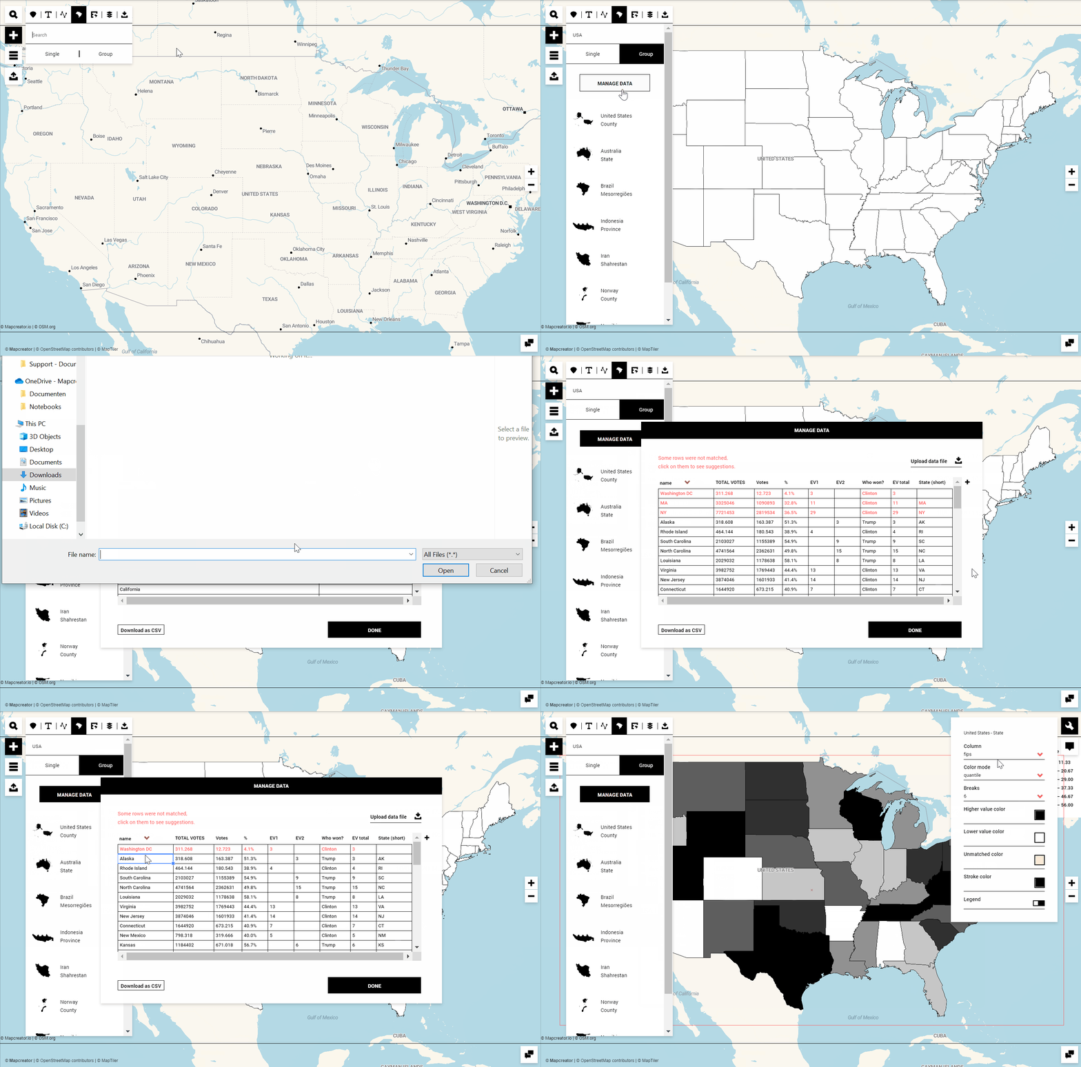
Set Areas
Let’s head to the submenu ‘Areas’ and search for the USA state set. We click on it to add the polygon set on top of the map, and afterwards click on ‘Manage Data’ to edit the data column. This is where we can upload our data file which contains the election data. The tool will match the file you’re importing with the Mapcreator data (in this case, state name). It can be that manual corrections for the matching need to happen in case the file has misspelled names or outdated FIPS codes. By double clicking on a highlighted cell, you can choose which state is the correct one. Once you click on ‘Done’, we can continue with the styling.
Set data column and color mode
The next important setting to consider is the data column and color mode. For this example, we’re selecting the ‘Who won’ column, the remaining information of the spreadsheet can be used to fill in interactivities to provide additional information to your online audience.
The color mode should be set to ‘categorical’. This will allow you to choose a specific color for both parties.
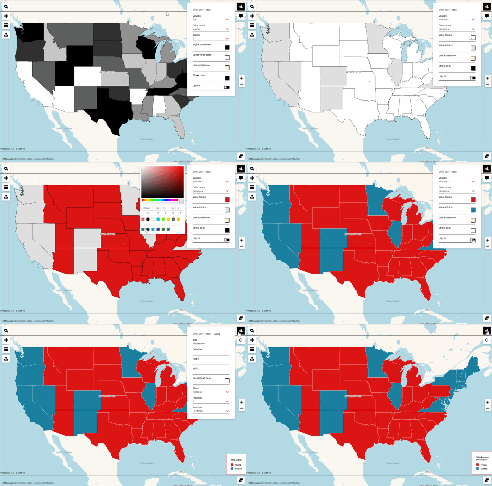
If you create this map for your newspaper or TV show and you need a static SVG output file, you can navigate to the ‘Export’ menu, adjust your final settings for size or output file, and download your map.
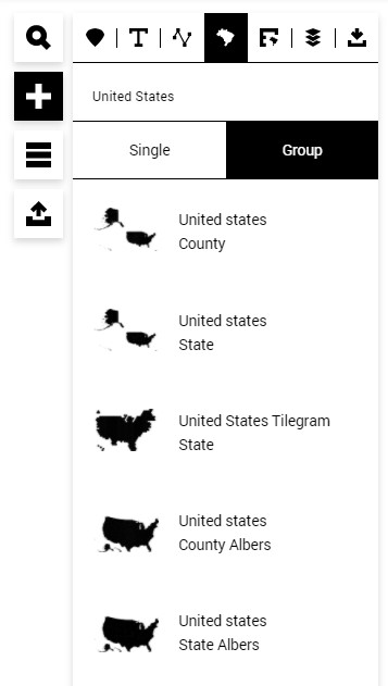
Pro tip: Typically, such statistical maps use a different projection system to see Alaska and Hawaii closer to the mainland, the Albers USA projection. You find the data set in the ‘Grouped Areas’, use this one to match your data with.
And another tip: Choropleth maps typically don’t have any other map layers such as place names or water and other country boundaries. You can hide these layers using the ‘Elements list’ menu, or you change your map style to “Choropleth” or “us-election-2020_labels”, which will bring the states' abbreviations to the map.
Contact us if you don’t have this map style.
Make your election map interactive
The spreadsheet you’re uploading might contain more information than just which state has voted for which candidate. You might have the amount of casted votes, the percentage of absentee ballots, the total of electoral votes, or the electoral votes assigned when a state has been called. All this additional data can be made available to your readers using interactivities.
To make this happen, let’s move to the interactivity tab of the states’ settings, and start linking the columns containing the data:
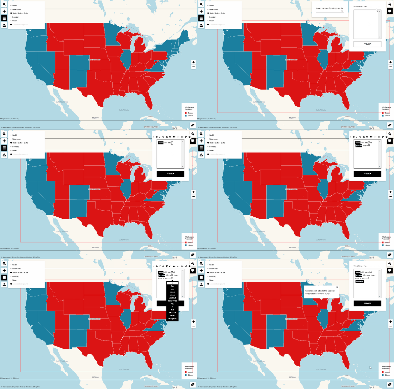
Export your election map
Afterwards, we head to the export menu to download our map as a ‘WEB’ map to retrieve the iframe or map URL. Final settings such as changing the map language or restricting the zooming and panning also happen here.
Keep in mind: any change you make to your map will automatically update the previously generated map link. If your map was already published online, you simply need to refresh the page to see the latest updates.
Electoral Votes Tilegram
For this article we’re using the U.S. election dummy data.
You can easily create an insightful map that shows all the electoral votes of the US elections. To achieve this, take the following steps:
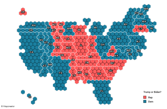
- Prepare the tilegram.csv file for each electoral vote, either state Rep, Dem or any other value
- Create a new map
- Select the Tilegram map style
- Add the United States Tilegram Grouped Area
- Click on Manage Data to upload the tilegram.csv and style the colors
- If necessary, change the map layers order
- Download your map
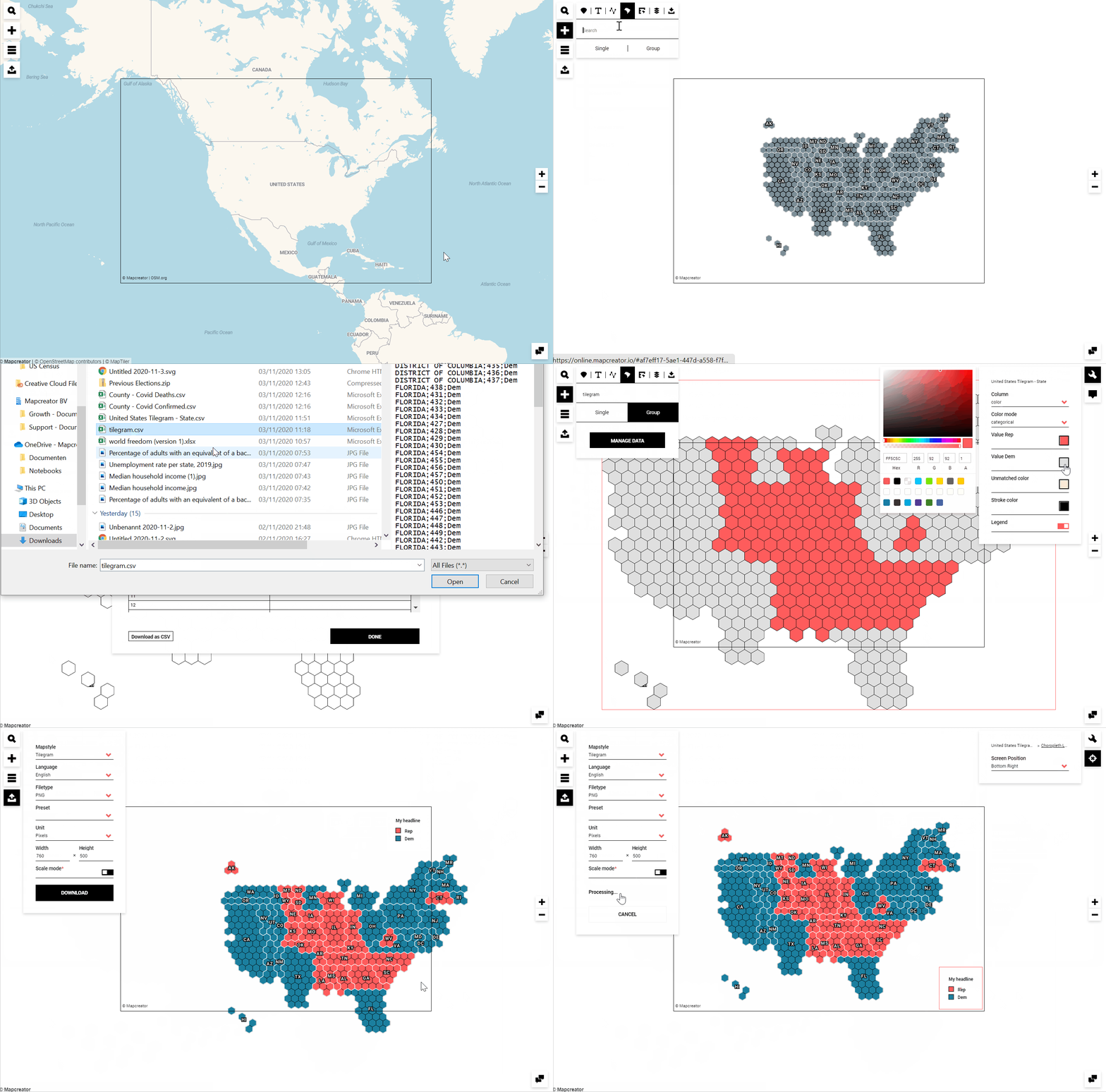
Mapcreator’s election maps can be used to broadcast on news websites, social media, or any streaming channel you want. But if you want to get them static, an election map can also be exported in .png format, printed out, and hung on walls.
Download files
Base data incl. featureIDs for the US County Election Albers grouped area set
Presidential Election counties 2016
Presidential Election counties 2012
Presidential Election counties 2008
Presidential Election states 2016
Presidential Election states 2012
Presidential Election states 2008