In choropleth maps, colors indicate values per area (e.g., countries or provinces). So the first step is to prepare a spreadsheet with the names of the areas you’d like to highlight and the data associated with them:
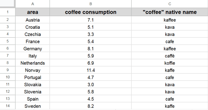
The data can be quantitative (coffee consumption) or categorical (native name).
Note: If you don't have a table with names, there is no need to create one from scratch. You can add the required shapes from the Areas menu, download the attached table, edit it, and then upload it back.
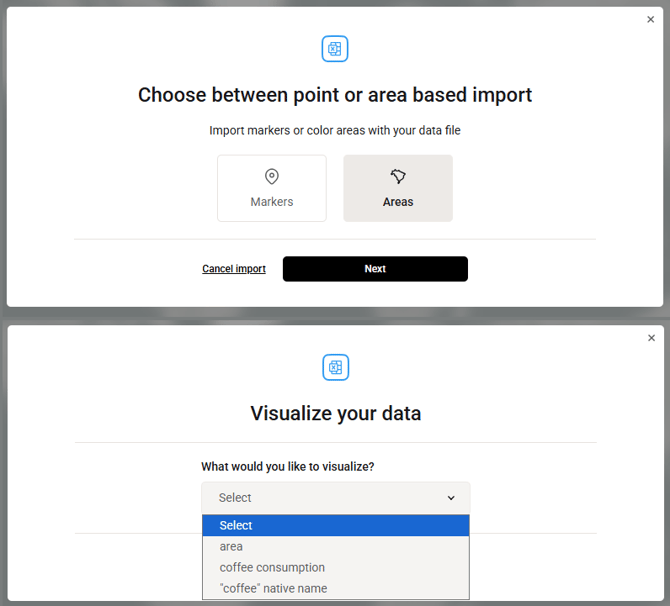
If you use your own spreadsheet without adding shapes beforehand, you can drag & drop it to import. The areas will be automatically recognized and added. You only need to select the areas as a data type and pick the relevant data column.
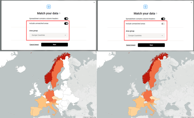
While matching your table with our data, Mapcreator suggests options in the Area group drop-down. For example, for this spreadsheet we can select the “Europe Countries” group. If “Include unmatched areas” toggle is enabled, the remaining European countries will appear as areas with no data, and you can assign a color to them. If this toggle is disabled, only the areas from the spreadsheet will be highlighted.
After the data is imported, click on the added areas to adjust the color scheme and configure the legend.
Styling quantitative data:
For visualizing quantitative data, you can choose the color scale that best fits your use case:
- Continuous - smooth gradient across the entire data range.
- Quantize - range between min and max values divided into equal-sized intervals.
- Quantile - buckets containing approximately equal numbers of values.
Styling categorical data:
Learn more with related videos