This documentation is always evolving.
A Choropleth map can ideally be used to visualize statistical data such as demographic information or election results by highlighting the respective areas in different color shades.
Table of content:
At this moment we cover numerous standard underlying polygon sets which is one of the prerequisites for a successful data matching process. The current polygon sets mostly cover administrative boundaries such as country, province or county borders worldwide. We’re constantly working on adding new data sets for you. If you’d like to report a polygon set that you wish to use in the Mapcreator tool, please send our Support Team a message.
The power in creating a great Choropleth map starts at the basic, but most important step: your data. You can already have a spreadsheet ready, or you can work with the data download Mapcreator offers you. Let’s have a look at both of the options. Also, let’s think about whether your map should be created for print or for creating an interactive online map. The latter can be edited in order to reveal more information, referring to content from the imported data file, within popups or a sidebar once the reader of your map clicks on them. Thus, the more detailed your data file is built, the richer your online map will be!
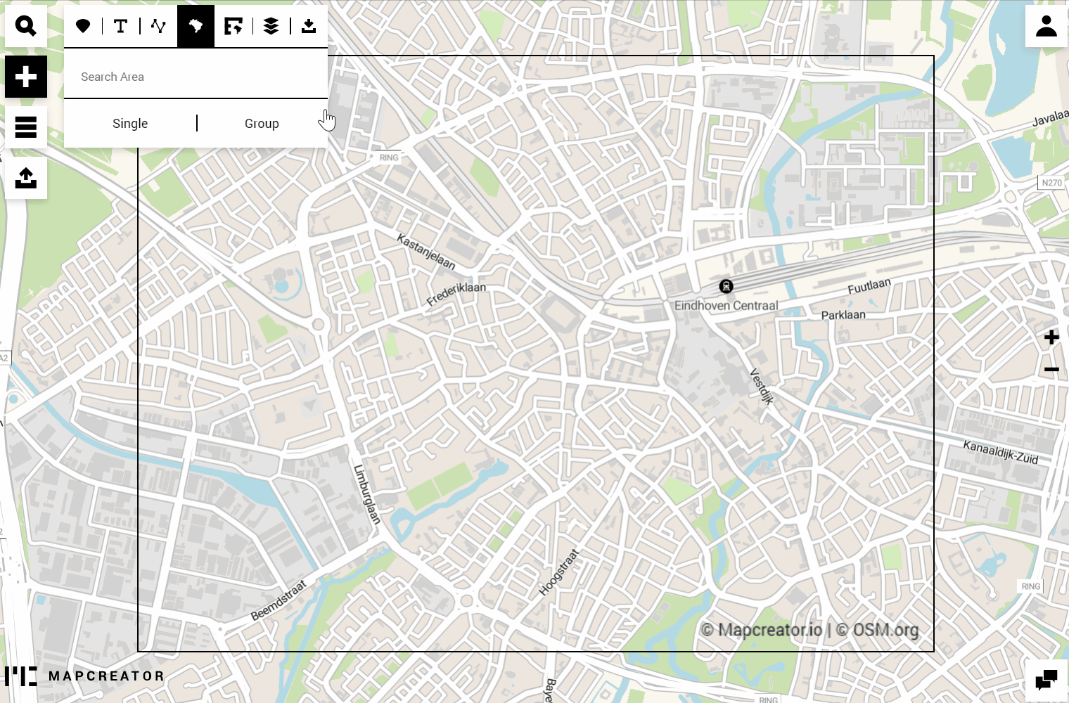
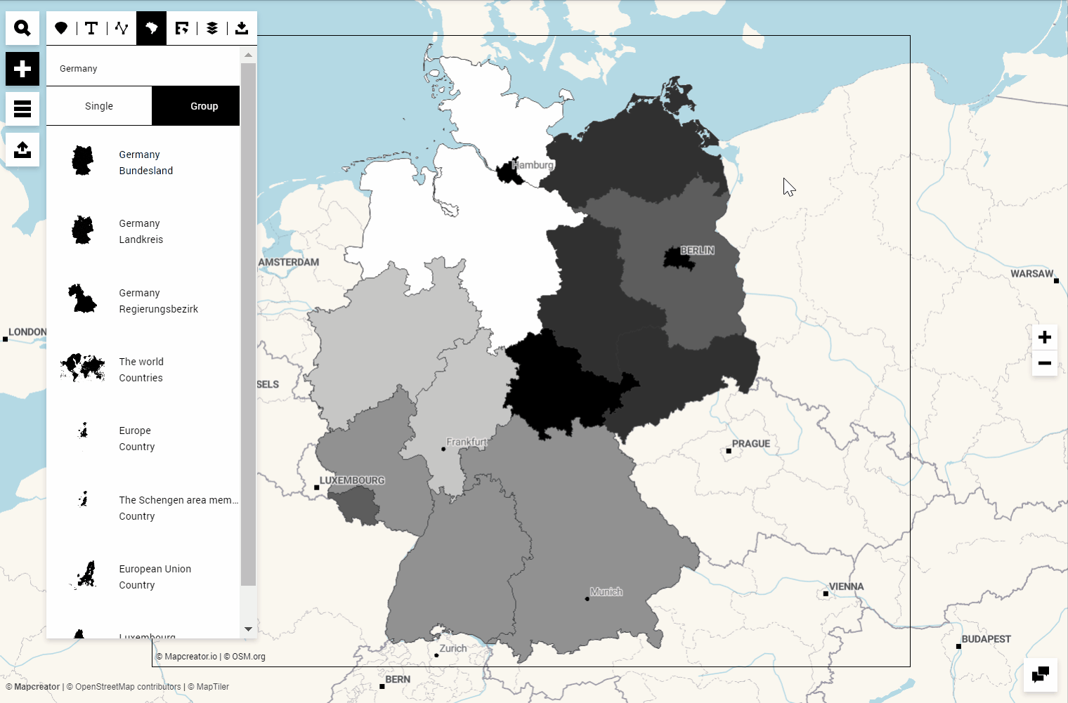
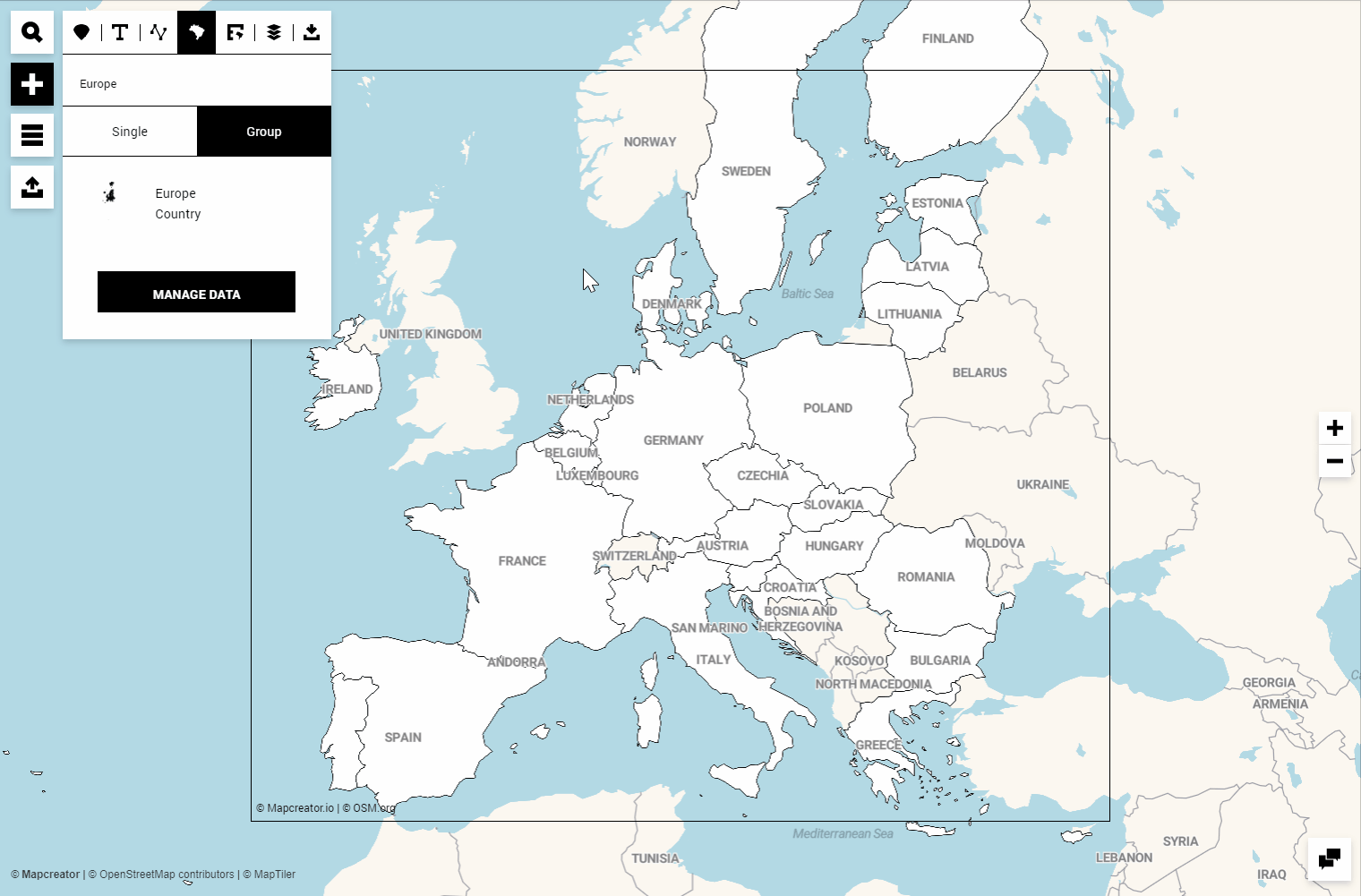
To work with the polygon sets, let’s move to the Areas menu in the tool. You can differentiate between Single, which allows you to place one single polygon (or more), and Group, which places an entire polygon set. In this article, we focus on these only.
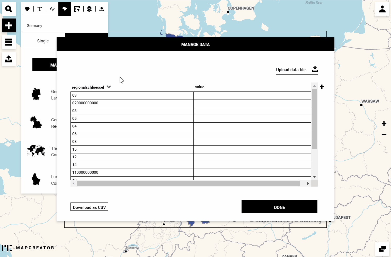
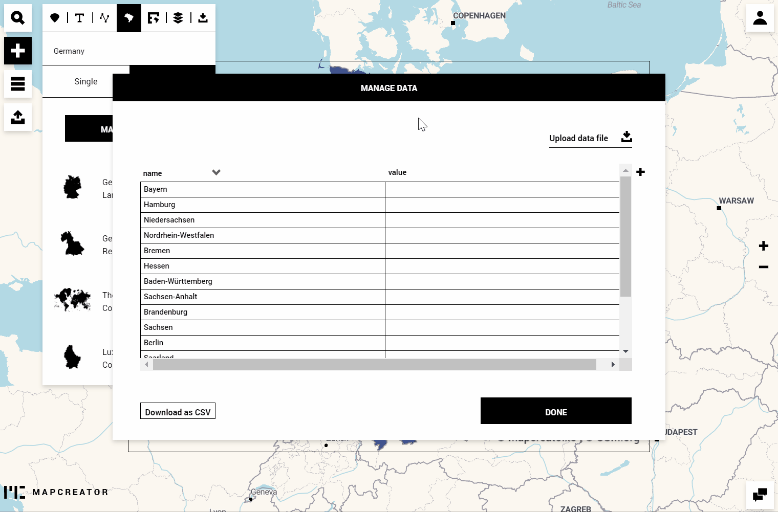
Let’s select the area you want to create this map of. Click on Manage Data to either
b) change the data table in the tool.
Depending on which polygon set you chose, there are different matchable parameters available. This selection will be crucial for the data matching step which follows later. Possible parameters are Name, ISO country codes, or common local parameters like i.e. FIPS (USA) or Regionalschlüssel (Germany).
Method a) Download Mapcreator’s data, edit and upload it
Select which of the parameters you’d like to match your data with and click on Download as CSV.
You can open this file (with i.e. any text editor or Excel program) and add your data in at least one or more columns. Here’s an example of how the file can be built:
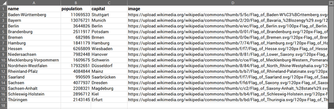
As mentioned above, if your map is supposed to be created for print, the minimum you need is the column for “population”. The additional information like “capital” or adding an image link is meant for the purpose of creating an interactive online map.
Let’s import the file and match the data. If all goes well, the system immediately recognizes the correct names and adds the data to it. In case you made a typo while editing the file, the system will highlight unmatched cases for you which you can adjust. Double-click on the red cell to select one of the available suggestions.
Now it’s time to style the polygons.
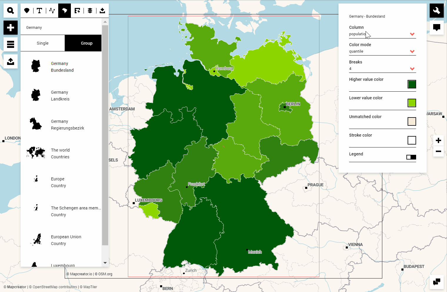
First of all, select the first dropdown choice of the Data column to be the one with the data you’d like to visualize. Look for the import file’s table headers. Your cells’ content can be numbers, but also “strings” (words, letters, names) for the “categorical” color mode. We’ll cover the latter a bit further down this article.
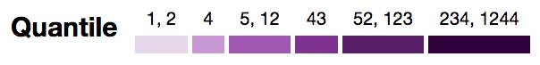
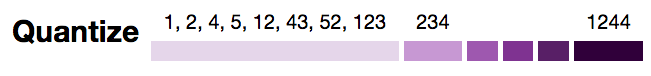
The second dropdown menu for the color mode offers you “quantile” or “quantize”. It depends on your data which one of those is recommended, but you can roughly understand them as follows:
Quantile: All the sorted numerical values are spread evenly into buckets, whereas each bucket is represented by one color. The size of each bucket is calculated using the following ratio: number of values / number of colors.
Quantize: Quantize scales are similar to linear scales, but instead of using a continuous range a discrete scale is used. The breaks are applied by creating segments based on equal size between the minimum and maximum values.
These color modes, illustrated exemplary on the values
[1, 2, 4, 5, 12, 43, 52, 123, 234, 1244],
behave as follows:
Source: Medium.com
Lastly, we can choose the colors and the legend:
Color breaks: Choose between 2 and 9 colors. The mixing is based on ColorBrewer. They recommend that even though increasing the number of classes might result in a “rich” map, it’s also important not to overwhelm the readers by compromising the map in legibility.
Colors: You can choose the higher and lower level color as well as the colors for unmatched cases and the stroke.
Legend: Will be automatically created and added to your map. You can hide or enable it again, and re-position it to your liking. Once you click on it, you’ll see options that allow changing the Legend title or characters for delimeter, pre- and suffix.
If you’re satisfied with this map for print, you can move to the Export Menu to adjust the map size and download it in the desired file type.
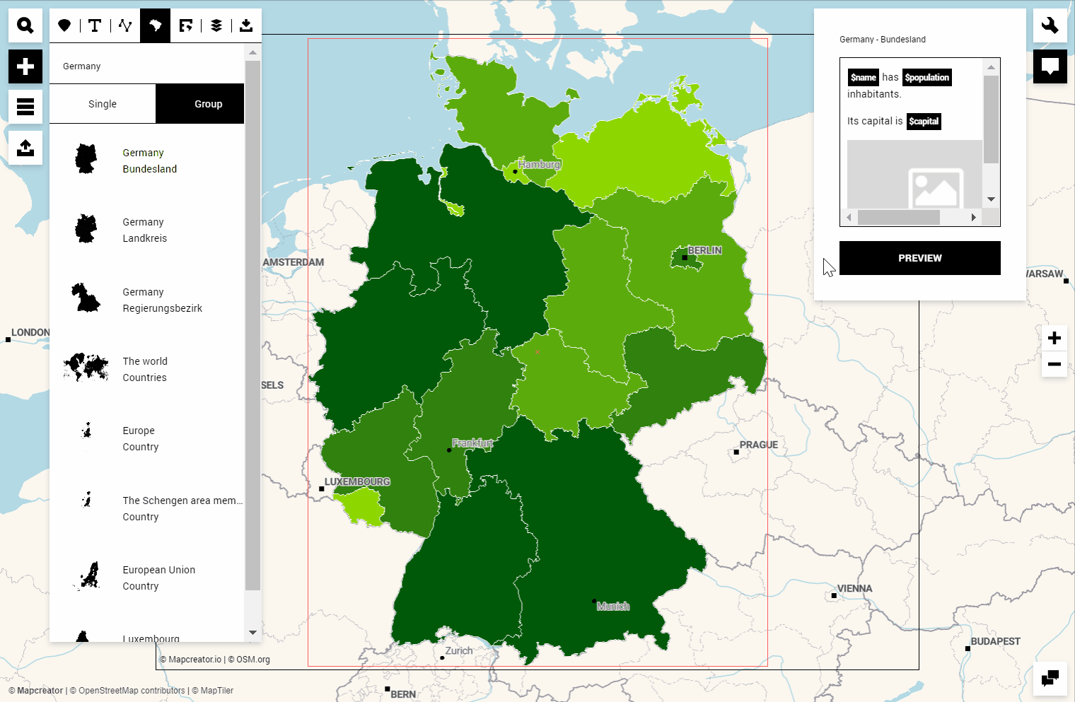
At any point, you can further annotate your map, add adornments or hide layers that you don’t need. For now, we’ll go ahead and prepare the same map for an online output and add interactivities. We’ll include text and the image which are listed in the spreadsheet:
To preview an example, click on the Preview button or go directly to the export menu to output the iframe and link. Before we do that, we could add annotations like labels or icons, or hide layers you don’t want to show in your example:
Let’s talk about the “categorical” color mode. If your data consists of for example election parties, categories like high-medium-low, or any other combination of letters or words, this color mode will allow you to determine a specific color for each entry. The best thing is, you actually don’t even need to have data available to color the polygons; if you simply look for a way to highlight, i.e. several countries within Europe or some regions within a country, you can select and color each polygon individually. Both ways, you have full control over the visualization of your data.
Method b) Change the data table in the tool
Instead of uploading a data file, you can also edit the data table directly in the tool. You may even use familiar spreadsheet features like drag-down or copy-paste to auto-generate the content. The plus button on the right-hand side of the table allows you to add additional columns. Let’s have a look together:
The remaining steps stay the same. You could download this map right away, or you add interactivities and prepare the map for an online output.
Pro Tip: If you’d like your choropleth shapes to be the only elements on your map and remove all other map layers like labels, roads or water, there are two simple ways to get this done: Either apply the “Choropleth” map style you find in your map style list, or, hide all other map layers from the Elements list.
Try out our final result: